Banner Studio
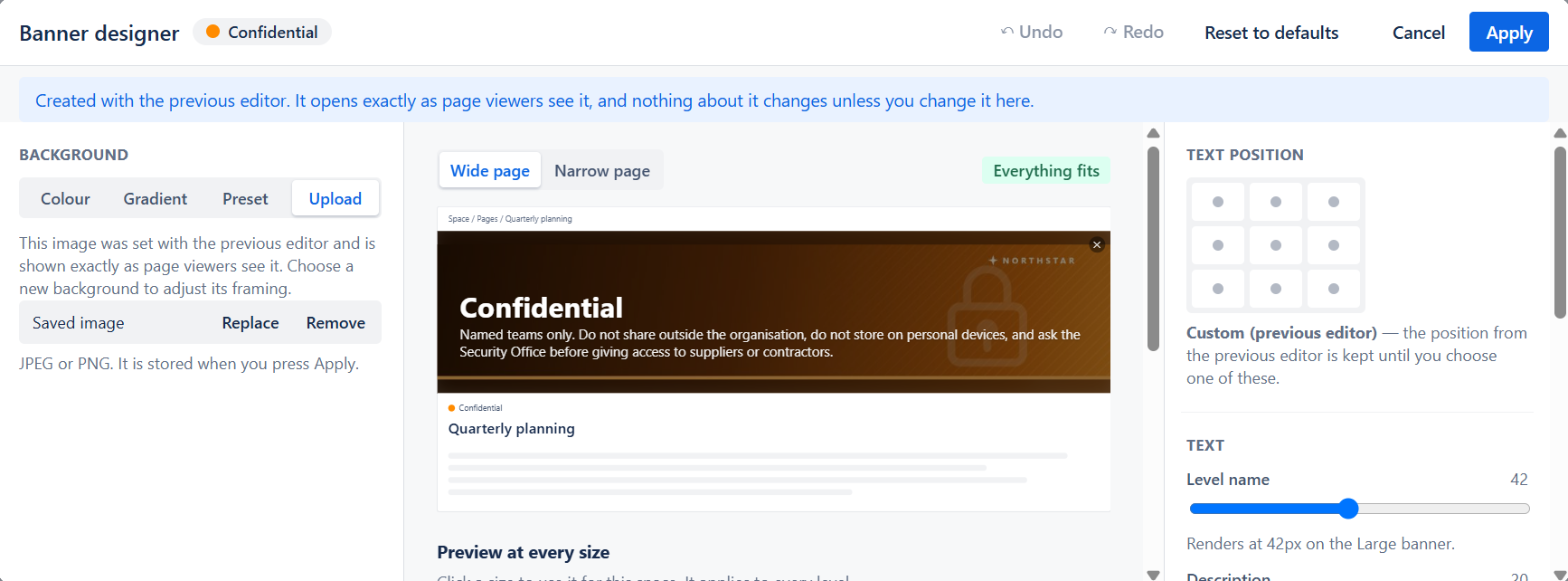
The Banner Studio is a full-screen designer for the visual banner of a classification level. You choose the background, place and size the text, and check that the result is readable, with a live preview of the banner as page readers will see it.
The studio is available wherever classification levels are edited:
- Space Settings, for a space’s own levels. You need to be a space admin.
- The global template editor, for the levels of a global template. You need to be a Confluence admin.
Opening the studio
Section titled “Opening the studio”- Open a classification level for editing in Space Settings or in a global template.
- In the Page Banner section, choose Show banner.
- Click Open banner designer.
- Design the banner, then click Apply.
- Back in the level form, click Save Changes.
Cancel closes the studio without changing anything.
The level form card
Section titled “The level form card”The Page Banner section of the level form shows:
- A preview of the banner.
- A one-line summary, for example Gradient · Text on the left · Contrast 7.1:1.
- None or Show banner. None turns the banner off for this level. The byline dot still shows the level.
- Open banner designer and Remove.
Background
Section titled “Background”The left panel sets what is behind the text. Choose one of four sources:
| Source | What you get |
|---|---|
| Colour | A solid colour band. Use the level colour or pick a custom colour. |
| Gradient | A two-colour gradient with a start colour, an end colour and an angle. |
| Preset | One of the built-in background images. No upload needed. |
| Upload | Your own image, in JPEG or PNG format. |
Tint by level colour is available for Colour and Gradient. When it is on, the colours come from the level’s own colour, so every level that uses this style shows its own colour.
Uploaded images
Section titled “Uploaded images”For an uploaded image you can also set:
- Focal point — click the part of the image that must stay in view. The banner is wider and shorter than most photos, so the image is cropped to fit. The focal point decides which part is kept.
- Zoom — from 100% to 250%.
The image is stored when you click Apply. A very large or detailed image is compressed. If it is still too large after compression, the studio asks you for a smaller or simpler image.
Replace chooses a different image. Remove clears it.
The right-hand panels control the level name and description on the banner.
Text position
Section titled “Text position”Choose one of nine positions: top, middle or bottom, each on the left, in the centre or on the right. Until you choose one, the text sits on the left.
Text size and colour
Section titled “Text size and colour”| Setting | Range | Default |
|---|---|---|
| Level name | 16–72 | 42 |
| Description | 10–32 | 20 |
These are design sizes, not final pixel sizes. Under each slider the studio shows the size the text really has on the space’s current banner size. A Small banner has little room, so a large value may have no visible effect there. The studio tells you when this happens.
You can also choose Light text or Dark text, and turn on a Text shadow.
Legibility overlay
Section titled “Legibility overlay”Image backgrounds only. A semi-transparent layer between the image and the text makes the text easier to read:
- Flat — an even layer over the whole banner.
- Left fade — strongest behind the text on the left, fading out to the right.
- Bottom fade — strongest at the bottom, fading out upwards.
Opacity sets the strength, from 0% to 80%. With dark text, the overlay is light instead of dark.
Contrast
Section titled “Contrast”The Contrast panel estimates how readable the text is against its background. It shows the contrast ratio and whether it passes WCAG AA for small text (4.5:1). WCAG is the web accessibility standard that most organisations follow.
If the other text colour reads better, a button such as Use dark text (8.2:1) switches to it in one click.
The check is a guide only. It never stops you from applying a design.
The preview
Section titled “The preview”The centre of the studio shows the banner on a sample Confluence page, using the same component that draws the banner for page readers.
- Wide page and Narrow page show the banner at two page widths. The text fits differently on a narrow page.
- A status shows how the text fits: Everything fits, Text reduced to fit, Text held at minimum size, or Description cut off.
- Preview at every size shows the banner at Small, Medium, Large and Auto side by side, with the text size each one produces.
Choosing the banner size
Section titled “Choosing the banner size”Click a size card to preview the banner at that size. What happens on Apply depends on where you opened the studio:
| Opened from | Clicking a size card |
|---|---|
| Space Settings | Sets the banner size for the whole space. It applies to every level. |
| Space Settings, when the global template sets the size | Preview only. The template decides the size. To override it, use Header image size in Space Settings. |
| Global template editor | Sets the template’s banner size. Not set lets each space keep its own size. |
Undo, redo and reset
Section titled “Undo, redo and reset”- Undo and Redo step through your changes. You can also use Ctrl+Z and Shift+Ctrl+Z.
- Reset to defaults restores the default text and legibility settings. The background is kept.
Nothing is saved until you click Apply, so you can experiment freely.
Banners created before the Banner Studio
Section titled “Banners created before the Banner Studio”Existing banners are not changed by the Banner Studio. A level keeps exactly the banner it had until an admin changes it and saves the level.
When you open such a level, the studio shows a note: “Created with the previous editor. It opens exactly as page viewers see it, and nothing about it changes unless you change it here.”
Two older cases have their own behaviour:
- Text inside the image. In the first version of Classify, the level name and description were painted into the header image. The studio shows “Text is part of the image” and holds back the text, position, overlay and contrast controls, because that text cannot be changed. Choose a new background to convert the level to live text.
- A custom dragged position. A text position dragged in the previous editor is kept and shown as Custom (previous editor). It stays until you choose one of the nine positions.
Related
Section titled “Related”- Page Banner — how the banner appears to page readers.
- Space Settings — classification levels and the space’s banner size.
- Global Templates — designing banners for a template.